Fountain Pens
Last Updated:
I’m starting to get into writing with fountain pens. There are a lot of options to consider! Pens and nibs and inks and papers and everything and they’re all inter-related and affect each other.
I’m keeping this page and one about inks just to collect my thoughts together to keep them straight. My preferences seem to change from day-to-day.
Will they long-term replace my favorite gel pens? Maybe. They’re certainly more fun to write with.
Because I like to write small on 5mm dot grid paper (I use 0.38mm gel pens when possible) I started just buying pens with extra-fine (EF) nibs, though I’m learning that for Japanese companies like Pilot and Kaweco what I actually want is a fine (F) nib. At least on journal paper that’s the right size for me.
Pilot
Pilot Metropolitan
These pens are delightful. They have a sturdy and heavy brass body. The fine nib (which is what I use) is in Japanese sizing, so it ends up being even thinner than a Lamy or TWSBI extra-fine.
It writes incredibly smoothly, with a very consistent line of ink. And it’s less than $20!
This is very much in the running for my everyday pen, inked up with something versatile. It also sounds really nice uncapping.
My complaints, which are minor, are:
-
I’m not a fan of squeeze converters because it’s hard to see when they’re clean, you can’t tell how much ink is in them, and they feel fragile.
Which means using a CON-40 converter, which is a small extra cost and they’re a bit finicky to get a full filling. (But watch Brian Goulet’s video on filling the CON-40 for tips.)
-
There’s no demonstrator option. I like to see the cool insides of the pen and the ink sloshing around, but brass is not clear and there aren’t any with little windows. (TBH I’d happily swap the metal for a good quality plastic like in the TWSBI Eco if it meant seeing the inside.)
JetPens has a guide to the Metropolitan, including the gel pen and mechanical pencil. (Neither of which I’ve tried.)
Pilot Prera
I like that these are demonstrators. They have the same nibs as the other Pilot pens in this range, which are currently my favorite nibs for width and consistency.
They also look pretty good, and are rather light but still feel substantial.
In my hand these are really pushing the low end of sizes I can comfortably hold, unfortunately. I definitely need to use them posted just to get something to maneuver. Given that and because I do prefer a bit heavier of a pen, the only thing I like about these over the Metropolitans are that I can see the innards.
They do seem sturdier than the Explorers, even for being smaller, but if I really needed another Pilot demonstrator I’d probably try to get the clear Explorer (which has a different finish from the turquoise one I have) because it would be easier for me to handle.
Pilot Penmanship
These are cute little lads, though the cheap price does not include a converter.
The EF is very fine, which works great on cheaper Field Notes paper though may be a bit spindly / scratchy on better-quality paper. Still totally usable, though, unlike the Kaweco Sport EF that was too dry for me.
This is apparently the cheapest source of Pilot EF nibs (which are not sold separately) if you want them for an Explorer or Metropolitan, but I haven’t seen a need to go finer on those pens.
Pilot Explorer
I have this in turquoise (on brand) and clear demonstrator. It’s light and plasticy. As far as I can tell there’s not anything to recommend it over the Metropolitan, since they share the same feed and nibs. It’s even a few bucks more expensive.
The matte plastic on the turquoise doesn’t feel good, but the clear plastic of the demonstrator is nice and smooth and sturdy.
It can apparently handle a CON-70 converter, which holds more than the CON-40 that fits in the Metropolitan.
I have an intention of trying to eyedropper the demonstrator, since it’lll hold a ton of ink beautifully, though I’ll have to get over my reluctance to use epoxy. The end of the barrel has a cap that does not appear watertight. (Hopefully that’s the only reason why JetPens says it’s not eyedropper-convertable.)
TWSBI
TWSBI Eco
I love the look of this pen. It’s a piston-fill demonstrator, so it holds a lot of ink and you can see it sloshing around.
I was a bit nervous that the knob for the piston is exposed; there’s a danger that it might twist in a bag or pocket and squirt ink into (hopefully) the cap. But so far it seems to stay pretty tight. There’s also a little runway before the twisting starts to move the piston, for safety.
The EF nib is a bit wider than the Pilot Metropolitan F, but this pen still looks and feels great. It has a scratchiness to it that I find very appealing and screams “fountain pen!” to me.
My understanding is that piston-filling pens need some amount of maintenance, and the Eco comes with a wrench and grease for when things get that far. We’ll see if it becomes troublesome to deal with.
TWSBI Diamond 580ALR
This is at the top range of what I’m (currently) willing to pay for a pen. But I liked the performance of the Eco a lot, and the Prussian Blue is an on-brand color for me. And: demonstrator.
It’s an absolutely gorgeous pen and I love the color and that it’s a demonstrator. There’s a huge resevoir full of ink I can see and I love it.
It’s also big and heavy, to the extent that it feels like a pen for writing when you’re sitting at a table or desk. I was sprawled on my bed writing in my journal and it was a bit unwieldy.
The grip is something I’m getting used to. It’s metal, rather than plastic, which is fancy and premium, with groves running around it. While those grooves make it stable up-and-down, they, along with the weight of the pen, make it a bit awkward to rotate to get it to the proper orientation. Which is pretty key for a fountain pen.
I may also stop posting the cap, both to reduce weight/bulk and because it ends up making a rather tight fit over the piston knob. I find myself very nearly twisting the cap to unpost it, which would likely result in spraying ink over myself and my stuff (especially since, definitionally, the pen would not be capped at that moment).
Twisting off the cap I’m also getting used to. It does make it less convenient for quickly jotting down some Rapid Logging in a journal.
So while it’s very appealing to me aesthetically, I’m still working out what I would use this pen for.
I also may want to try a mild solvent to see if I can remove the logo from the pen cap. That bit could look nicer is all I’m saying.
TWSBI Go
The spring-loaded plunger makes this very easy for switching inks. But the cap is on so tight that I’ve several times splattered some ink taking it off. And it feels like I might crack it if I post it too aggressively.
The plastic at the grip feels cheap. I’m okay with a plastic grip, but this is soft and almost too remininscent of those goofy pencil grips you give to elementary school students.
My TWSBI Go seems inconsistent. I don’t know if it’s the nib or the feed or what. This may be a sign of what some call “baby’s bottom.” This contributes to shading, but makes some writing look blotchy. You can see this in action by comparing the Pilot Explorer F nib (top) with the TWSBI Go EF nib (bottom) and Noodler’s 54th Massachusetts on Rhodia paper.

You can see the letters in “TWSBI” especially how the ink comes out inconsistently relative to the Pilot. On the one hand shading, on the other hand, blotchy.
Miscellaneous
Monteverde Regatta Sport
The rainbow edition of this (by “rainbow” they really mean “bisexual flag”) kept calling to me so I splurged with some Christmas money.
It writes incredibly smoothly (actually too smoothly for my taste) with a nice solid weight to it. I like the metal grippy sections and the magnetic cap. The rainbow nib is a cool touch.
My main disappointment with the design is that the opaque parts of the pen body hide the view of the converter, so you can’t watch the ink slosh around (or get a good sense of its level) which is my main draw for a demonstrator.
Sure does look gorgeous, though.
Lamy Safari and Al-Star
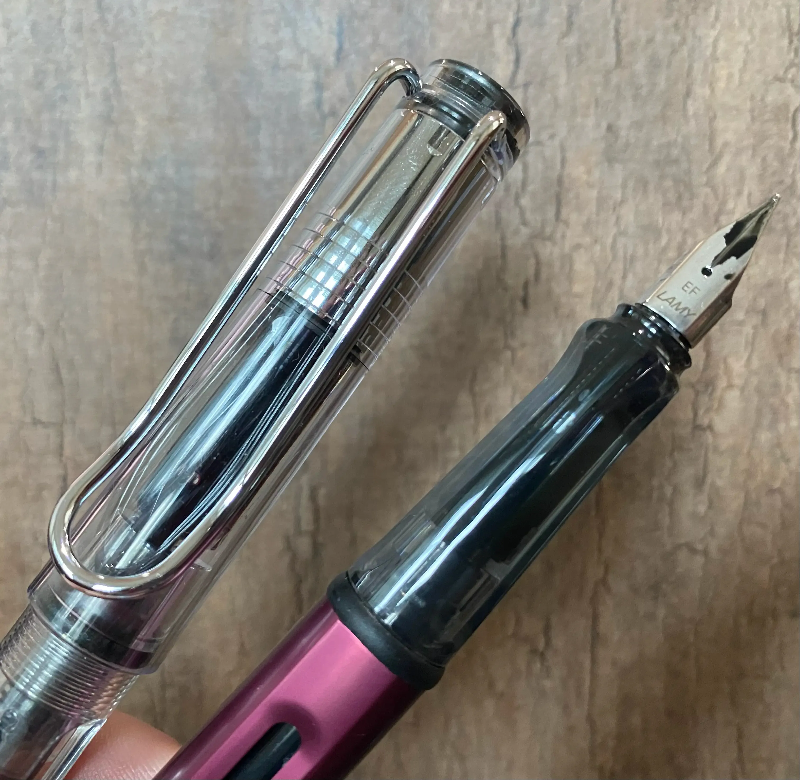
Love the Safari’s clear cap. You can sort of see the grip indentations on the Al-Star.
I’m grouping these together because as far as I can tell the difference is in body material. The Safari is plastic and the Al-Star is metal. Other than that the design seems to be the same.
In my (brief) experience, Lamy nibs are on the thicker side and also inconsistent. The nib on my EF Safari put down a noticeably thicker line than the one on the EF Al-Star. I got a replacement EF nib that brought it back to where I’d expect it.
These pens have a nice whispery feedback, while still writing smoothly, which I like.
I wasn’t too taken by the feel of the all-black Safari, but the clear demonstrator Safari Vista has a harder, smooth plastic and a great looking cap that exposes the metal of the sturdy clip. I’m starting to use the Vista during work meetings over a TWSBI because I’m regularly capping and uncapping it when taking notes.
The Lamy converter seems to have a good capacity and fully fills easily without the gravity tricks you need for the Pilot CON-40.
My clear Safari came in F rather than EF due to an Amazon mistake, but I decided to keep it. Since the wider nib of the Lamy means it’s not going to be my everyday text-writing pen, I’m okay using the thicker line for doing headlines and underlines and other splashes of color in my journals.
These pens also have indentations for where your fingers are supposed to go. I don’t mind them but it’s worth being aware that they effectively make the grip a bit narrower than it appears.
Sailor Compass 1911
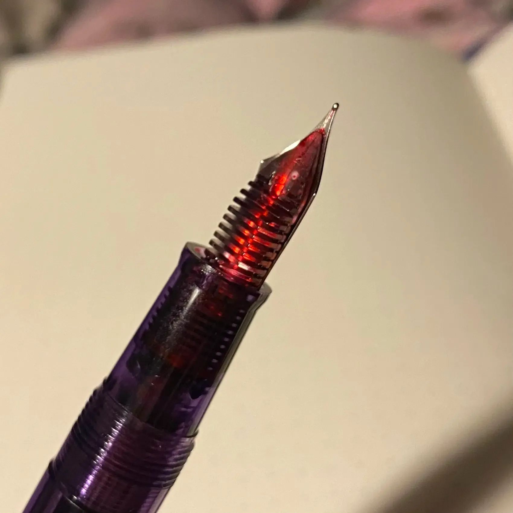
The Sailor Compass 1911 showing off Noodler’s Black Swan in Australian Roses through its transparent feed.
Seems nice, and a reasonable deal on sale for $30, definitely doesn’t seem worth it at the list of $50. I got a transparent purple, so there’s some demonstrator action though it’s more purple than transparent so you only get a hint. I like the touch it coming with a converter that matches the pen color.
One cool thing about this pen is that the feed is transparent, so you can see the ink color on the underside of the nib.
The medium fine nib leaves a thin line, and actually seems to write a bit dry and slightly scratchy. I like its size and shape, but it doesn’t write as well as the Metropolitan.
It also seems to be slightly leaky. I have to take more care to store it nib-up.
Diplomat Magnum
I got the Prismatic Purple from Goulet Pens because I liked the color. It’s mermaidy.
It’s not quite as nice in person and is very thin and light, which is not to my taste. The EF nib was too dry and stuttered some.
Overall kind of disappointing, and I may not leave it inked up. A good lesson to start limiting my pen purchases to ones that I have a stronger interest in.
Kaweco Collection Skyline Sport
This one was very disappointing for me. I may have had better luck with a fine, but the extra-fine does not lay down enough ink. It’s dry and scratchy and inconsistent. It takes a lot of pressure to keep a line, and even then it’s not consistent.
While it photographs pretty well (I went with Light Lavender), it is too small for my hands and the plastic doesn’t feel great.
Faber-Castell HEXO
Got this because it took standard cartridges, before I realized that bottled ink was much more interesting and easier than I thought. I like the shape of it, but the texture of the body is not to my taste. It’s a kind of metallicy plastic. I prefer when pens just own it with a solid, smooth plastic, like the Prera or the Eco.
I don’t (yet) have a converter for it, so I haven’t gotten a chance to try it with more interesting inks.
JetPens Beginner Fountain Pen Sampler
To be honest I wouldn’t recommend this set. They’re five very basic black pens that, because many of them don’t have converters or are refillable at all, mean that you don’t get any taste of that part of the fun of fountain pens.
Pilot Petit1
It’s a cute little bullet! Not quite too short for my hands. Unfortunately it doesn’t take converters, so it’s either cartridges or converting it to an eyedropper pen.
Pilot Varsity
I like the shape of the nib, but disposable fountain pen? Not into it. Currently my only medium Pilot.
Platinum Preppy 03
It’s a pen. Bit of a chonky barrel, and the plastic’s not too bad. The nib has a sort of resistance on the page. Not a scratchiness, but there’s a slowness to it.
The provided ink is a thin dark gray.
Zebra V-301
I like the sort of industrial look of this. Downsides are that the “fine” is a very thick line and it has no official converter (though online posts indicate that a Platinum converter should fit). I saw some reviews that say they couldn’t get ink to flow, but that has not been my experience.
Probably the standout pen in this mediocre set if you’re ok with a 0.7mm sort of thickness. Writes smoothly, just too wide for my tastes (at least for a black ink).
Zebra Zensations
Another disposable pen. shrug